Statistical graphs are often used to display the data values of a random sample. In the following sections, we will consider bar charts, pie charts and line graphs.
Bar Charts
Bar charts are often used to present data in a pictorial form to
illustrate the information collected and highlight important points.
They are especially useful to depict monthly car production, monthly sales,
quarterly profit, average annual rainfall etc. A bar chart provides a
useful comparison of data over time. The height of each bar shows the
total amount of the item of interest for each month (or year).
Bar charts are drawn with parallel bars placed vertically (or
horizontally). The widthof each bar andthe spacingbetween the bars are kept the same to avoid giving a misleading
representation. The height of the bar is drawn to scale to represent
the amount of the item.
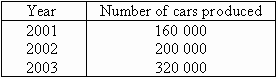
Example 8
The yearly production of cars by a particular company is recorded as
follows:
Draw a bar chart to display this information.
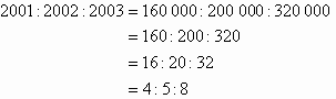
Solution:
Thus, bars of equal width whose heights are in the ratio of 4 : 5 : 8
will represent the company's yearly production.
Note the following:
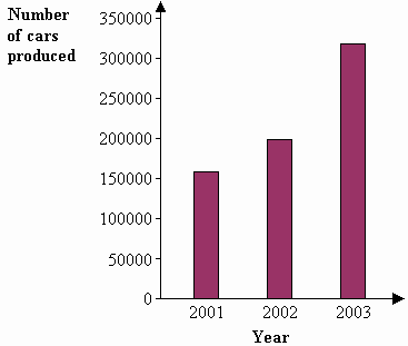
It is simple to read a bar chart. Just look at the required bar
and read off the value. E.g. The bar chart shows that the number
of cars produced was 160 000 in 2001, 200 000 in 2002 and 320 000 in
2003.
Bar charts are used to describe only simple pieces of data but can
describe a data set clearly and provide immediate visual impact.
It is clear from the bar chart that the car production by the company
had increased more slowly between 2001 and 2002 than between 2002 and
2003.
Bar charts are useful for presenting data sets consisting of a number
of values that are each assigned to different categories such as years,
months, quarters etc.